7 great Examples of Best Footer Design for E-commerce Website

Does your website footer really matter? What does a well-designed footer bring to your ecommerce website? A high-quality ecommerce website will help you in reaching out to more customers. A best footer design can actually improve your following without the need to invest in a physical location for your business.
Adding an ecommerce feature to your website is an effective and affordable way to reach out to more customers online. Moreover, when it comes to functionality, a responsive footer with a carefully thought-out design adds value to your online business.
How To Make A Good Footer For An Ecommerce Website?
Footers are often not given as much importance as other sections of a website. In spite of that, a well-designed footer can enhance the overall experience of your users.
The question is, does your footer enable your customers to quickly navigate website links and redirect them to a page where they intend to go?
How do you make sure you are delivering a perfect ecommerce page footer to your customers?
It must be user-friendly - An ecommerce website footer must be responsive and properly designed to suit all gadgets, such as mobile phones, tablets, laptops, and desktops. A mobile-friendly design should allow users to access key features of your website when viewed on a bigger screen.
- Content must be comprehensive – Write website contents that are relevant to your company. It should highlight your business goals and objectives. The structure of the content must be engaging and allow for usability as well.
- Well-designed aesthetics - The look and feel of the footer must go well with the rest of the website and its background.
Footer Features to Look Out For
With these things to consider, here are some important footer design tips for your ecommerce site. We have also included examples of an ecommerce page footer from selected websites that may serve as an inspiration for you to improve your brand presence.
1. Contact information
Your contact information is important in putting up a website. If you want to succeed, you don’t only need to introduce your business and make it available only, you should also be accessible. If no one would know how to contact you, you are missing a lot of opportunities.


Typically, a footer must contain your address, business map, email address, and contact number. This way, your customers can easily reach out to you when the need arises.
Vans website, for example, include their contact details so their clients can easily reach out to their customer support.
It’s also advisable to put your company logo in the footer so it would be easier for your customers to remember your brand.
2. Security and Credibility
A footer is the perfect place to demonstrate your company’s reputation in the industry.
In this section, you can showcase your awards, recognition, or memberships. This way, people know your business exists and you are someone credible to make business with.
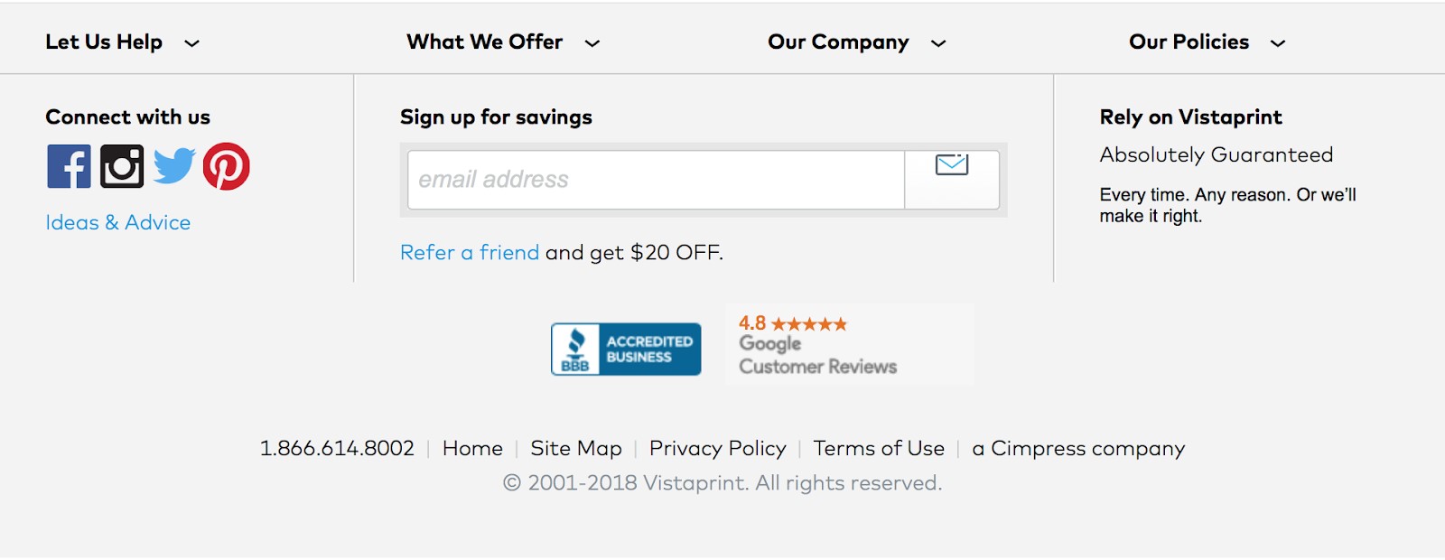

Vistaprint, a global ecommerce website that markets products for small businesses, uses their footer to show to their customers they are a reputable to make business with.
Aside from being an accredited business of Better Business Bureau, an ethical marketplace where buyers and sellers trust each other, Vistaprint also included in their footer, their Google rating of 4.8 rating to show customers they have a high trust rating.
3. Terms of Condition
A legal information and a privacy policy are also important to consider when building your online store. It protects and prevents against legal issues arising from online transactions, such as privacy concerns and fraudulent transactions.

Like most ecommerce platforms, Volusion, provides a privacy policy on their footer to protect users from privacy and security issues.
4. Site Navigation Links
Your website navigation links help keep customers engaged while browsing through your website. One way to do this is by creating a call-to-action to encourage visitors to subscribe to your newsletter or join your mailing list.
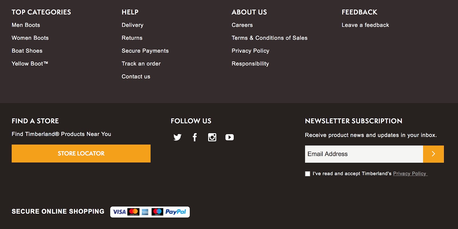
One perfect example of a website with a click through CTA (call-to-action) button is Timberland, a popular online shoes and clothing store. They use site navigation links to engage their customers to join their mailing list.
5. Copyright
The copyright information is a must for your footer section. It is a simple way to protect your ecommerce website from plagiarism; however, this doesn’t always discourage thieves from stealing your content.

Apple, for example, updates their copyright information every year. Changing it every year may seem tedious, but it’s actually easy and needs only minor tweaking of your website’s html code.
6. Sitemap
Many website designers usually put in the footer the html version of the sitemap, although it doesn’t always end up being used by website visitors.


Shopify, a popular ecommerce platform on the internet, puts a sitemap on their websites to allow search engines to index URLs that they might have otherwise missed.
7. Social Media
Linking social media accounts on your ecommerce website is a trend among online business owners these days. It shows customers that your business exists and they can easily reach out to your company in whatever social networking platform they prefer, whether on Facebook, Twitter, or Instagram.


It is also a great way of engaging your customers to support your products or services. By just a simple click on a social media icon, customers can follow you online.
A great example is Nordstrom, the online store of one of America’s most popular chain of department stores, which uses their footer to grow their social media following.
Make The Footer Work For You
Now you’re already familiar with some of the most important elements of a custom footer design for ecommerce website,
While the footer is an important part of a website, it shouldn’t distract your customers with unnecessary clutter. Focus only on relevant links and make sure that it provides only little bits of information about your business.
A perfect example of an uncluttered but useful website footer that makes use of some of the elements we listed earlier belongs to Fireart.Studio.


Their website footer focuses only on the most important and relevant information of their company, such as the logo, contact information, a call-to-action, and a brief description of their business.
Lastly, while footer belongs at the bottom of the website, it doesn’t mean it’s less important than the other sections of your page. If used and designed properly, can drive huge traffic to your ecommerce website, eventually leading to an increase in revenue for your online business.
Post a Comment